Showing posts with label graphs. Show all posts

Monday, 4 November 2013

Homemade gps plot of London

One of the limitations of www.gpsvisualizer.com is that it has an upper limit on the filesize of the raw GPS traces of 3mb. The log of treks across London reached this data limit at the start of last week, and whilst there were some measures I could take to reduce the size, it was unsatisfying and a better solution was required.

Using my bare ninja skillz I wrote a script in perl that processed the raw gps data from a txt file and then generated a png image file from scratch.

perl script
Larger version of map
AllTraces file

Writing the script myself allowed me to more finely control what was being plotted. One of the first things I added to the plot was a grid. This was simply done by creating a txt file with the coordinates and then drawing them as lines rather than points.
grid file

As well as gps traces of my walking routes across London I'm also tracking routes that I travelled on public transport and by car. These are plotted in red.
vehicle log file

One of the problems I've encountered and not satisfactorily addressed is that the gps coordinates are latitude and longitude, which because the world isn't flat, don't have a consistent aspect ratio. As you go further north from the equator the latitude ought to get closer together. This is why the grid squares are rectangular. If I lived in sunnier climes they would be more square.

As I'm mostly wandering round one city on the surface of the earth I can approximate a fixed aspect ratio. Although I could really do with getting my head round a better formula, something to do with the radians and the cosines.

Sunday, 7 July 2013

London rents and advertised properties revisited

Continuing my series of blogposts looking at the vagaries of the average rents in London, this time with even more fancy graphs.

I'm not trying to make any arguments or be judgmental, I'm just playing around with a dataset, trying squeeze out as much information as possible, look for any interesting patterns, speculate on their causes and then looking for evidence.

Let me remind long term readers of this blog that I get my data from the rightmove.co.uk website, searching for how many two bedroom properties there are in each London borough at various price points. This allows me to calculate the average rent for two bedroom properties on the market in each borough and then generate a graph like this one for July 2013 so far.


Broadly we can see that boroughs with lots of two bedroom properties have higher rents than boroughs with few two bedroom properties on the market.

Somewhat predictably Westminster, as the UK's seat of power, has the highest average rents, closely followed by the perhaps the most high-end shopping district in the world, Kensington and Chelsea.

For a few moments I thought that there was a correlation between the size of the borough in terms of population and the number of two bedroom rental properties on the market. I ran a graph using the population estimates from wikipedia from the 2011 census and average number of properties per month for the last 14 months.

There's not much of a correlation. You can't say that boroughs with a smaller population have fewer properties available, or vice versa. Kensington and Kingston have about the same population, 160,000, but the former has around five times as many properties available. Richmond and Barnet have about the same number of available properties, but the former has half the population of the latter.

Even a trend line in Excel is just about flat.

Its possible that if you split the boroughs on the chart into two groups you could get some nice correlated lines. I had a go using the categories of inner London and outer London boroughs, but it wasn't very satisfactory.

There was some degree of correlation between borough population for inner London boroughs, but outer London was pretty much flat, and there was quite an overlap between the two categories.

At this point I should perhaps list a few assumptions:-
  • Two bedroom rental properties on the market as a proxy for the all rental properties on the market
    It takes an hour or two to scrape the data, in order to check other property types would be beyond the limited of my concentration. Once I did scrape the data for one bedroom properties and the shape of the graph was much the same as the graph for two bedroom, so I took this to mean its a valid proxy.
  • Rightmove.co.uk as a proxy for the entire London rental market
    Clearly there are other sources, Gumtree, and individual property management sites. And clearly each other source will cover a slightly different section of the market. Gumtree covering the lower end where the rents don't justify the advertising cost, and high end rental agencies coping for the elite and exclusive. At anyone time Rightmove.co.uk has around 30,000 two bedroom rental properties in the London area.
  • Mean average rent as a proxy for the shape of the borough's entire market
    I've had discussions about whether the mean is valid compared to the median, and over on the Londonist site there go so far as to discuss the upper and lower quartiles for each borough. These I could calculate, but it's beyond my attention span to do regularly and I feel there's something a little dishonest about it, it gives more ammunition to cherry pick data that supports specific arguments.
  • Properties advertised on the market as a proxy for actual rents
    This is a problem I've run into when comparing my data with other people's. Whilst the average rent advertised on Rightmove may increase in a borough, it doesn't follow that every person in that borough's rent suddenly increases, that landlord go knocking on every door and put the rent up, in fact, that's a little illegal. Other data mongers, such as LSL Property use a sample of a few thousand buy to let landlords to calculate their index, that may be appropriate for sitting residents, but for someone who is looking to move, its not so good.
  • The rental properties advertised on the market as a proxy for all rents - This one perhaps undermines it all. What does it mean that in Richmond last summer there were 450 two bedroom properties advertised, and this summer there are three times as many. Are people leaving Richmond in droves, leaving landlords grasping for new tenants, or are developers quickly building hundreds of new buy to let properties? Is it possible to tell from the available data? I don't know
As I've been tracking the number of properties and average rents for a while now, its possible to generate a graph showing how these things change of time. I wasn't quite sure how to do it, so I've invented what I'm going to call an Inksplatter chart which will show the four variables.

Let me explain the example Inksplatter chart to the right. On it are the average rents, and number of two bedroom rental properties each month for four different boroughs. The smaller the dot, the further in the past the datapoint is. The larger the dot the more recent the datapoint is.

We can easily see the direction of change for each borough:-
  • Borough A is moving to the north west of the graph, this means that average rents are decreasing and the number of properties is increasing. In answer to the complaint that there aren't enough properties and rents are too high, I will call this type of behaviour 'Socially Good'.
  • Borough B is moving to the north east of the chart, rents are increase, and properties available are increasing.  For landlords and property management I call this behaviour 'Boom'.
  • Borough C is moving south east, rents are increasing, but the available pool of property is drying up, I call this 'Socially Bad'.
  • and finally with Borough D, average rents are falling and the the number of properties is decreasing, this is 'Bust'
With this in mind, let me present an Inksplatter chart of the changes in average rent and available properties in London boroughs between May-2012 and July-2013


In retrospect, this chart fails in that its not very easy to see what's going on, its very poor at conveying information. However, there are bits and bobs we can discern from it:-

  • The City of London has had a wide range of average rents over the period, but the number of properties advertised barely changes.
  • In Tower Hamlets, the average rent drifts about just over £2000 per month, but the number of properties advertised drifts between 3000 and 3500, with no discernible trend
  • In Camden, the number of properties has increased from 1400 to just shy of 2000, with the average rent staying consistent until the last month, where average rents appear to fall by around £100

Zooming into specific boroughs displayed on the chart elucidates some more interesting trends


Here we can see the following:-
  • Southwark and Richmond are both displaying 'Social good' behaviour, in that the drift is to the north west, that is, more properties and lower average rents.
  • Hammersmith and Fulham is display the same trend, but with a smaller increase in properties.
  • Lambeth and Wandsworth are both displaying 'Boom' like behaviour with increasing average rents with but small increases in properties
  • Hackney was displaying a 'Boom' trend until the last month where average rents fell


Stepping away from the Inksplatter charts, it would be illuminating to categories all 33 London boroughs, into the four groups, 'Social good', 'Boom', 'Social bad' and 'Bust'

Social good
Boom
Social Bad
Bust
Hammersmith Barnet Barking City of London
Kingston Upon Thames Brent Bexley Tower Hamlets
Lambeth Camden Bromley
Lewisham Croydon Enfield
Newham Ealing Havering
Richmond Greenwich
Wandsworth Hackney
Haringey
Harrow
Hillingdon
Hounslow
Islington
Kensington
Merton
Redbridge
Southwark
Sutton
Waltham Forest
Westminster

Does this sound right?

I don't know

Anyhoo back to the Londonist / London Councils and their claim that in Kensington and Chelsea the lower quartile rents have gone up by £260 between January 2012 and January 2013

By my reckoning average rents there are around £2900 per month. I don't have exact figures on what the median, lower and upper quartile rents are, but I do have figures for how many two bedroom properties were listed on Rightmove in June 2012 and June 2013.

Last year in June there were 1,800 two bedroom properties listed and now there are 2,400 of them, so that's a 30% increase in the number of propertied advertised. We can see from the graph on the right that this increase wasn't evenly spread across the spectrum of price points. It looks like there was actually an increase in the number of lower end properties available, although in Kensington and Chelsea the lower end is still £1500 to £2000 per month. The other increase seems to be in the upper end, and hardly any increase in median priced properties.

I reckon that the Londonist's quoted £260 increase is more of a statistical anomaly from the change in the profile, and the increase in properties available, rather than there being fewer cheap properties available.

To finish off this piece a few quartile monthly rents statistics for all of London:-

One bedroom properties
Lower quartile - Between £1,100 and £1,200 per month
Median - Between £1,400 and £1,500 per month
Upper quartile - Between £1,800 and £1,900 per month

Two bedroom properties
Lower quartile - Between £1,500 and £1,600 per month
Median - Between £1,800 and £1,900 per month
Upper quartile - Between £2,500 and £2,600 per month

Three bedroom properties
Lower quartile - Between £1,600 and £1,700 per month
Median - Between £2,200 and £2,300 per month
Upper quartile - Between £3,000 and £3,100 per month

Thursday, 23 May 2013

Londonland rents - the average

This London rent thing has been bugging me for a week or so. I was going to let it go, but last night þere was a piece on whatever BBC news program about gentrification in Brixton and how rising rents were forcing out the natives, so market traders were getting people buying fruit and veg like they used to in the old days.

Brixton

On the one hand I feel for the fruit and veg sellers, on the other hand (like Iron Man might say) businesses go out of business all the time, þere's no need to be a pussy about it. But with pieces on the BBC, something didn't feel right.

Rents going up, rich people moving in, the native population being forced out due to rising rents, that's the general line from the BBC.

Brixton is part of Lambeth.

According to figures scraped from rightmove.com average rents in Lambeth for two bedroom properties have fallen by about 3% between May 2012 and May 2013, from £1,745 to £1,695 per month for a two bedroom property. This is mainly because þere are around 17% more properties on the market þere, for two bedroom properties þere were 830 this time last year and þere are 970 this year.

Its possible that average rents in Brixton have risen, but in the rest of Lambeth have fallen even more so, so the borough average is down, but its unlikely. Likewise, its possible that average rents for properties with more or fewer than two bedrooms have risen disproportionately to two bedroom properties, but its unlikely. So either my figures are wrong or the figures the BBC used are wrong.

Falling rents

At this point, I'd like to veer off and discuss the nature of rents. For individuals, rents hardly ever come down, your landlord is only ever going to keep the rent you pay the same or they'll raise it. If for example their mortgage rate falls, they're not going to voluntarily pass the reduction on to their tenants. Pretty much the only occasion where an individual rent will fall is if the tenant has a change of circumstance: "sorry guv' I lost my job and the missus is up the duff, we're going to have to move out if you don't reduce the rent, an' we've always been such good tenants, and never caused no one no bother."

For properties, rents do come down, if they're sat empty on the market for a while the landlord might offer a lower rent, that is, if þere is no demand at one price point. Or if the property has turned crap, developed faults, got fucked up by the previous tenants or is in need of modernisation, the rent may fall, or if the area has become crap. But this only happens if the property is empty.

For average rents in a specific area, average rents could fall only if þere are a lot of empty properties on the market, or if new properties have been brought to market.

So if an an area is in decline, or if a lot of people for some reason have decided to invest selflessly creating in low value housing, for very low returns.

Anyhoo, with these points in mind, for the rest of the article when I refer to rents falling or rising, I mean in general, on average for two bedroom properties that are on the market and not secret.

I live in a nice flat in Walthamstow, it has two bedrooms and a garden and I pay £800 per month. The rent hasn't changed for three years, despite the average rising by £50.

LSL Property Services

Moving on. At the moment, whenever you search twitter for 'London rents' þere are dozens of people fretting about news articles that regurgitate a press release and paper by LSL Property Services, with a headline factoid about London rents increasing by 7% year on year.

This is at odds with the figures I scraped from Rightmove where London rents are up around 3%, broadly in line with inflation and also highly variable within the London boroughs. Some are down 3% some are up 7%, but broadly, they follow inflation.

I believe the methodology used by LSL and their consultants Wriglesworth, is to blame. We're looking at different things. Whilst I'm scraping the prices of every property listed on Rightmove for all of London, some 30,000 properties on the market, LSL use a sample of 18,000 properties from all over the UK with tenants currently paying rent.

Its like I said earlier about how my rent hasn't changed but the rental market in Walthamstow has gone way higher.

LSL split their sample of 18,000 properties into 11 regions in England and Wales which suggests a sample size of between 1,600 to 2,600 properties per region. For London this could amount to a sample of between 50 and 100 properties per borough, covering all property sizes, one bedroom, two bedroom and more.

Tower Hamlets has 3,000 two bedroom properties on the market, so maybe an order of magnitude more than that with sitting tenants which LSL are trying to model. I believe LSL's sample size is a bit small for the level of accuracy they proclaim. But hey, we're counting different things.

Maybe, like political polling companies, they're have a really well crafted representative sample of rental properties. Maybe

Still, their report on rents has been very successful in the media, with coverage in The Evening Standard, The Independent and the BBC.

A little too successful perhaps, its quite a specific report for a small niche, buy-to-let investors who want someone else to manage their property. The report is good for the sort of returns investor can hope to receive, and its good for whipping up hysteria about the market, less so for people looking to rent.

Average London rent

The other headline factoid in the LSL report is that 'average' rents in London have reached an all-time high of £1,110 per month. Maybe it is for the properties that they manage, but no explanation of what sort of properties that refers to, residential or industrial, how many bedrooms or whereabouts. For buy-to-let investors, the intended audience for the LSL it doesn't really matter, but for people looking to rent in London, its more significant.

Its misleading.

For people actually looking for somewhere to live, for somewhere to rent, the mean average two bedroom rent is £1,957 per month, the median two bedroom rent is about £1,925

For one bedroom flats, the mean average monthly rent is £1,617, the median is about £1,475.

As has been pointed out previously the spread of rents is a bit skewed, þere aren't many cheap places, but þere's no limit to how much you can pay.

Here's a chart showing the market profile in London for one- and two bedroom properties


Despite the high demand for cheap / affordable housing in London, the market seems unable to offer many two bedroom places below £1,000 a month.

Market distortions

It is my belief that Housing Benefit, in London, artificially distorts the market and provides a rent floor below which no properties are available at any standard, be they rat infested, moldy or just really small, all are available for £1,000 or more.

This means that anything not rat infested, moldy or really small is on the market for a lot more than £1,000.

I'm not sure how to demonstrate or prove this market distortion, but perhaps playing round with the data some more will help.


So, despite demand and all the bluster from politicians, the number of two bedroom properties on the market London for lets than £1,000 a month has fallen.

Saturday, 11 May 2013

Londonland Rents - A year later

One of the most popular posts on this site, as you can see from the sidebar, is my post from May 2012 about the average rents in each London borough. Admittedly a lot of traffic comes from google sending people here looking for a map of London boroughs, but anyhoo, its still an interesting topic.

The other day, on twitter, Sarah retweeted comment from Emma Jackson about how rents in London were crazy and average rents in Newham had shot up 39% the last year. Alas this information came from a press release a year ago, but it got me wondering about what rents were like now that the Olympics is firmly in the past, and how rents have changed from last year.

So I dug out my old spreadsheet, went through the rightmove.com property website, and counted up how many two bedroom flats there were in each London borough at each price point, weaved some Excel magic and well here's a list of average rents last year and this year, and their percentage change.

Borough
10 May 2012
08 May 2013
Change
Merton  £   1,581.29  £   1,766.93 111.74%
Redbridge  £   1,080.05  £   1,193.77 110.53%
Hillington  £   1,112.92  £   1,201.08 107.92%
Bexley  £     858.70  £     914.26 106.47%
Enfield  £   1,135.41  £   1,201.74 105.84%
Croydon  £   1,014.19  £   1,063.27 104.84%
Westminster  £   2,796.06  £   2,918.95 104.40%
Greenwich  £   1,332.97  £   1,387.40 104.08%
Waltham Forest  £   1,092.00  £   1,134.49 103.89%
Barnet  £   1,419.80  £   1,465.49 103.22%
Southwark  £   1,840.94  £   1,899.17 103.16%
Barking  £     967.14  £     994.93 102.87%
Kensington and Chelsea  £   2,856.73  £   2,907.43 101.77%
Ealing  £   1,578.19  £   1,606.16 101.77%
Sutton  £   1,029.41  £   1,046.86 101.70%
Hounslow  £   1,785.18  £   1,808.97 101.33%
Hackney  £   1,876.80  £   1,898.31 101.15%
Lewisham  £   1,224.56  £   1,236.24 100.95%
Camden  £   2,359.67  £   2,375.90 100.69%
Kingston Upon Thames  £   1,402.73  £   1,412.13 100.67%
Brent  £   1,483.54  £   1,491.47 100.53%
Harrow  £   1,248.56  £   1,253.38 100.39%
Bromley  £   1,127.81  £   1,131.87 100.36%
Havering  £     967.49  £     963.83 99.62%
Islington  £   2,217.82  £   2,185.26 98.53%
Lambeth  £   1,745.46  £   1,708.09 97.86%
Haringey  £   1,432.51  £   1,401.14 97.81%
Richmond  £   1,927.33  £   1,878.68 97.48%
Tower Hamlets  £   2,066.11  £   2,011.83 97.37%
Newham  £   1,410.63  £   1,373.49 97.37%
Wandsworth  £   1,844.08  £   1,756.62 95.26%
Hammersmith and Fulham  £   2,102.78  £   1,993.76 94.82%
City of London  £   2,817.34  £   2,474.32 87.82%

Its perhaps more useful to see this on a map,


So average rents for two bedroom properties have risen in most of the suburban boroughs, broadly in line with inflation, and average rents for two bedroom properties nearer the centre of town have fallen, but its a mixed bag. One wonders why.

At this point I'd like to announce a new statistical product, GilMove Index of Average London Rent levels for two bedroom properties. This is basically the percentage the market has moved for the whole of London from a benchmark set in May 2012.

The GilMove Index for May 2013 is 103.31

That is, based on data scraped from RightMove.com for the whole of London average rents have risen by 3.31% With inflation in mind that's broadly to be expected.

Right now, RightMove.com lists about 29,500 properties in London, that's up 6,300 from a year ago, or 27.3%. Well done London. If there's a shortage of houses, the problem is being addressed.

Westminster seems to have over a thousand more properties on the market since last year, from 2,200 in May 2012 to 3,500 in May 2013. Is it because they evicted all the social tenants and put the properties in the private sector? Seems unlikely that that would account for so many properties, a few hundred I could understand.

Other boroughs with huge increases of  two bed properties on the market are Kensington and Chelsea with around 800 more, Camden with around 600 more and Richmond with 500 more.

So, could it be that in areas where more properties have come onto the market since last year, the average rents have changed the most. That there is some kind of correlation between these two things? Well, no. I ran the numbers and is absolutely no correlation between the two variables.

The only correlation I can see is that boroughs with very few two bedroom properties on the market have the lowest average rents, and boroughs with the most properties on the market have the highest rents.

I guess its a relatively free market, with supply and demand acting as they do. Less desirably places are cheap and with not much going down, desirably places are in demand and have lots of properties available.

Anywho, it was all pretty settled, until on Friday there was a tweet from a chap called Murray who was tweeting a link to an article in the Evening Standard about how in order to afford to rent a one bedroom property in London, you'd need an annual income of £38,000, and average income in the UK is £26,000.

Alarm bells in my head started ringing, firstly, its based on a government diktat that you ought to only spend a third of your income on rent, which is fine if you acknowledge it, but not really relevant to the way people live their lives. Some people will want to spend a greater proportion on their earnings on a more desirable location, some people may be willing to live in a cheap place to allocate their resources elsewhere. People are free to spend their money in many different ways. It riles me when the government says I can't afford something when clearly I'm in a better position to decide.

Secondly, it seems a bit rum to compare national wages with regional rents, London prices are almost like being in a different country to the rest of the UK. A more appropriate comparison would be London rents to the average wage in London, a bit of googling had the London mean wage being £40,000, so no problem renting an average one bedroom property.

Of course its arguable that you should use the median wage rather than the mean which is hellish skewed in London. But then the property market is similarly skewed, so you should use the median rent for a valid comparison.

Look, mean average one bedroom rents in Motherwell are £348 per month, you'd need to earn about half the average income to afford one, you could afford one if you had a minimum wage job without much of a struggle.

Anywho, I quickly clicked through Murray's link to find the Evening Standard with a rather short sensational article about London rents and wages.
The figure follows a Standard report last month that revealed rents in the capital are rising eight times faster than wages.
Wait... what. I've already established that rents in various London boroughs are all over the place, some rising, some falling and generally the rise is in line with inflation, 3.31%. But even then, we're getting toward the margin of error to say that average national wages are only rising at 0.41%. Its a bit of a stretch.

It seems the latest Evening Standard article just reproduces a press release from a website called Rentonomy which is...
an easy-to-use site that looks at London in a totally new way and gives you all the tools you need to find the right area for you
Awesomeness!

However I question Rentonomy's director of research, David Butler's use of national average wages for regional rents. Its inappropriate, sensationalistic, and crap.

The original Evening Standard article from April uses rent data from a different source lettings agency network LSL Property Services. They quote
Last month the average monthly rent in London stood at £1106, a rise of 7.9 per cent in a year and the highest level ever recorded.
I don't have my own data for rent levels in April 2013 or April 2012, so I can't vouch for its accuracy, but LSL's figures seem way different from rent levels from my figures from May to May. Maybe that's the figure for all properties, regardless of number of bedrooms. *shrug*

David Newnes, director of LSL Property Services, owners of estate agents Reeds Rains and Your Move, seems a bit disingenuous when he says:-
“Rents in London are red-hot. With only modest improvements in the UK’s housing supply, rents will keep being forced upwards.”
As I have previously established, London rents are nothing special compared to a year ago, more stable than in the Olympic year, were rents in London white-hot in 2012? Also, the London housing supply seems to have increased in several boroughs since last year. Up 27% overall, how is that 'modest', I reckon 'dramatic' would be a better word.

Maybe, it's all happened in the last month, and he was right back in April.

References
Source data on google spreadsheet here
Scraped from the RightMove property website

Thursday, 13 September 2012

#LonData


So yeah, I was at the #Londata meetup this evening, it was all about Big Data. I was a little out of my depth.

My depth being those job vacancy posts I did in 2009, those libor posts of 2008, and the London rents posts of 2012, all lovingly scraped by hand. Rather than the api-driven professional affairs of tonight's audience.

Anyhoo at #Londata a company called Bloom were showing off some pretty network diagrams illustrating influence on twitter. They look like dandelions and help companies identify who to engage with. Its all to do with who passes on specific messages on twitter and expands the reach of a client's campaign.

One thing I took away from the presentation was that I ought to change my profile details on Twitter to more accurately represent my interests. Or maybe not, maybe I can opt out of being a marketeer's pawn by having my interests as guinea pigs and Dutch politics, things completely incongruous to the content of my tweets.

Anyhoo, I was wondering how Bloom's networky authority stuff could apply to the indiepop music scene. Allo Darlin were playing at Kings College tonight so its kind of topical, and Allo Darlin are both the sort of band who's members go to lots of other gigs and are also the sort of band who played on a train platform at the seminal Indietracks 2008 festival.

There's a handful of bands and a handful of people who all go to the same concerts. Sure some gigs are full of other people and some people go to see other bands gigs, but there is a hard core who are key to the scene. This we already knew.

Maybe if they were diagrammed as nodes, each node is a person, the lines reflect going to gigs, the colours have no relevance.

This diagram is just to illustrate the concept, Alice from The Cosines has probably been to Moustache of Insanity gigs, Bill From Moustache of Insanity has probably reciprocated and Hannah from Owl and Mouse must have been to a Moustache gig at some point too. And Trev OddBox, he puts on most gigs within the scene.

But can twitter be used more intelligently than just spamming the usual suspects, and target people better than just me tugging on people's sleeves?

Information about who goes to what gigs used to be more freely available on songkick, you could look at anyone's gig history and filter it and easy build up an idea of who liked what gigs and who your gigmates are. But now this information is less visible and it takes minds greater than mine to extract it.

Hmm, I'm not quite sure what the point of this blogpost was, just a ramble I guess, with links.

Tuesday, 2 August 2011

The political spectrum in UK newspapers

From l to r Guardian, Independent, Mirror, FT, Times, Telegraph, The Sun (in the centre), Daily Mail, Star, Express
The other day I was wondering about which newspapers in the UK were left wing, right wing and which occupy the centre ground. This blogpost attempts to definitively investigate and plot which papers occupy which areas of the political spectrum.

It was last week when Tom Watson off of twitter was saying that the News of the World phone hacking scandal had reached a new low, with Sara Payne's phone being hacked. Sure it was a new low, but it wasn't much lower than the previous lowest low, I asked on twitter whether it was some kind of competition, @flashboy replied that it more like a plateau of shit. Phone hacking was a low for right wing newspapers, and for left wing newspapers their low was the Johann Hari plagarism scandal. But then if The Mirror is getting embroiled in phonehacking too, then that'll be a new low for left wing papers.

But which newspapers are left, and which are right?

I started with a quick look on the internet. Yahoo Answers had something a rather comprehensive list as the top answer, but the second answer caught my eye for it's wrong-cockedness:-
Left wing - The Guardian, The Mirror (sort of)
Middle - The Independent
Right Wing - The Sun, News Of the World, The Times, The Telegraph, The Star
Extreme Right Wing - Daily Mail, Daily Express

edit: Sheetwow and Rikstir [other yahoo answerers] - there are no extreme right wing papers in this country? In recent months, the Daily Mail has alleged links between Ed Miliband and Stalin and claimed that "liberalism" is caused by a faulty gene. Meanwhile, the Daily Express has run a poll asking its readers if they think our schools are being ruined by foreign children. In what way do you regard these things as "centre" anything?
How can there be extreme right wing papers without corresponding extreme left wing papers? Besides, The Independent is quite left wing, so I guess everything else does seem right to the left. Its all about perspective.

So I thought some original research would be necessary. For this I used the AllOurIdeas survey/suggestions website, I fed in a list of the top ten best selling national newspapers according to wikipedia's page on circulation (and The Metro), asked the question "which of these two newspapersis more right wing?", then pinged the link round twitter and Google+.

After about ten respondants the newspapers had been sorted into the following sequence, from left to right
The Guardian
The Independent
The Mirror
The Metro
Financial Times
The Times
Daily Telegraph
The Sun
Daily Mail
Daily Star
Daily Express

They're broadly in the order I expected, except for anomaly of The Metro, which of course is a free newspaper, so folk don't have to make an economic choice to buy it so shouldn't be in the list, however, it is published by Associated Newspapers, part of the Daily Mail and General Trust, I expected them to have a similar editorial line to The Daily Mail, but it seems it is perceived as being far more left wing than its brethren.

Anyhoo, based on just this sequence, The Times is a centre ground newspaper, The Daily Express is a far right paper and The Guardian is a far left paper.
Still that's not an appropriate resolution of the issue. Instead of the centre being the median point where half the newspaper titles are left of it and half the newspaper titles are to right, it should be about readership.

So if we include circulation figures (from wikipedia)
The Guardian - 279,308
The Independent - 185,035
Daily Mirror - 1,194,097
Financial Times - 383,067
The Times - 457,250
Daily Telegraph - 651,184
The Sun - 3,001,822
Daily Mail - 2,133,568
Daily Star - 734,311
Daily Express - 639,875

The total number of newspaper readers is around 9.5 million. The halfway point is around 5 million. It follows then that someone in the dead centre of the political spectrum, where half of all newspaper readers are on the left of him and half of newspaper readers are on the right, would be a reader of The Sun. That's what the centre ground looks like.

Say you break down the entire newspaper readership into three thirds representing the leftwing, the centreground and the rightwing, then still The Sun represents the entire cohort of the centre ground. The trio of the Daily Mail, Daily Star and Daily Express represent the entire rightwing. The leftwing of newspaper readership includes, as expected The Guardian, Independent and Daily Mirror and, somewhat counter to expectations, The Financial Times, The Times and The Daily Telegraph. Although that last three are rightwing compared to the Guardian and Independent, they are left of centre compared to the centre.

Left wing
The Guardian - 279,308
The Independent - 185,035
Daily Mirror - 1,194,097
Financial Times - 383,067
The Times - 457,250
Daily Telegraph - 651,184 
Centre
The Sun - 3,001,822
Right wing
Daily Mail - 2,133,568
Daily Star - 734,311
Daily Express - 639,875

Now, back to that barmy wrongcock from Yahoo Answers, accusing the Daily Mail of being extreme right wing, I bet he feels stupid now, in reading my methodology and research, cos look, its just right of centre, not extreme right wing, it can't possibly be any closer to being on the centre ground.

Just because a dreadful newspaper is dreadful, doesn't mean it is far-right, it just means you're a snob who hates people and thinks they're too stupid to be trusted to make their own decisions.

Sunday, 10 July 2011

Fitness Regime: Summer begins

The other weekend I was at a cousin's wedding in Dumfries, the weather was glorious, the family were in fine form and the bride look beautiful, but looking through various photies online, someone seems to have replaced all the photos of me with some kind of freakish photoshopped version where I'm all fat and double-chinned, kind of like my collar is the neck of a toothpaste tube, and my head is oozing out.

I used to be slender, you remember that, I blogged about it and everything.

So, its back onto the crosstrainer for me, as soon as I got back from Dumfries in fact.

So as is my wont, I've graphed my progress so far.
After one week, well, I'm doing better than my winter and spring fitness regimes. Usually I ease myself into the regime, just doing short distances for the first day or two, then taking another day or two off, to let my body adjust, but this time, I'm not allowing myself that luxury, and I'm going full-on, 10.5km every night.

Hopefully by the time I finish this tranche of cross-training in thirty days time, I'll have covered twice the distance of my previous attempts. I'll be so buff, I'll have single-handedly defused the UK's obesity timebomb.

Saturday, 9 July 2011

Pitying News of the World

I think its a pity that the New of the World newspaper is closing down. In this piece I’m going to be quite selective about facts, and biased, this is a torrent of poorly argued and ill-informed bullshit, but please, read on.

I’ve never bought a copy of News of the World. I might buy the last ever edition tomorrow for posterity, but other than that, its just not really the sort of paper I read, I’m more of a Sunday Telegraph sort of chap, or The Observer or Sunday Times, you know, pretentious like. NOTW was a bit to sensationalist and celebrity-orientated for me, not intellectual enough, but I am in the minority.

The main reason I think its a shame that the News of the World is shutting down is because I really like the idea of companies and institutions over a hundred years old still being in business doing the same sort of thing for vast periods of time. Like IBM or Western Union or ICIor The Guardian newspaper. There’s something reassuring about companies having survived the initial blip of a ‘good idea’, then out living the people who started the organisation, and then having almost always been there.

Sure, companies have to adapt and change in order to stay in business, IBM changed from mechanical counting machines and calculators, to computers and and then IT infrastructure services, but they’ve been broadly successful and are still doing the same thing.

I mourn the passing of Woolworths and Borders and Rumbelows from our high streets. They just couldn’t keep up and adapt and keep the customers and money flowing, and so they didn’t survive. Tis the nature of things.

But the passing of the News of the World, I think its unfair. It didn’t close down because people stopped buying it, it was very popular, the most popular of the Sunday newspapers according to wikipedia. Here’s this is the circulation figures for the top UK Sunday papers:-
           News of the World - 2,789,560
           Mail on Sunday - 1,958,083
           Sunday Mirror - 1,092,816
           Sunday Times - 1,039,371
           Sunday Express - 550,269
           People - 500,866
           Sunday Telegraph - 496,128
           Sunday Mail - 366,325
           Sunday Post - 317,896
           Daily Star Sunday - 316,712
           Observer - 314,164
           Independent on Sunday - 152,561
I tried to use google’s visualisation API to generate a treemap showing circulation, but couldn’t figure out how to embed it into a blog, so here’s a static image:-

News of the World sells about the same number of copies as the bottom eight Sunday papers put together. Some people really like buying it.

If it closed down because people stopped buying it and it wasn’t profitable or popular, then that’s fair enough, but that’s not the case.

The case is that less popular newspapers, and people who didn’t support the paper’s viewpoints, rather than trying to be more popular and sell more copies, or persuade the majority of the virtues of their views, they took out News of the World by other means, on a technicality.

Almost like trying to win a football match by killing all the other team’s players.
A small minority decided that a majority is wrong, and now the majority are not permitted to have that newspaper any more.

Murdoch or News International pulled the plug, not the Guardian, not twitter, not the BBC nor Vince Cable, they merely forced the decision.

Another thing that bugs me about this is that as well as not reading the News of the World myself, I don’t think any of my friends do, and all the blogs that I subscribe to online, they almost never link to articles in the News of the World, its always the Guardian, The Observer, The Independent or The Telegraph. Based on my view of the world, I’d reckon that News of the World has the smallest circulation. But we’ve seen how this is wrong, whoever it is that reads it, there’s a whole lot more of them than I can see, they are huge, hidden and silent.

There are almost ten times as many of them than Observer readers. So whenever the Observer or Guardian clamour for anything, there are ten times as many Sun and NOTW readers who don’t.

The other day I read this piece on Charles Crawford’s blogoir, and at the time I took it to mean that human’s are overwealmingly traditional and conservative, and that secular liberalism is a minority view which
since the French Revolution and then the Russian Revolution, a systemic attempt has been made by supposedly progressive tendencies to downplay certain essentially human ‘traditional’ values and to ‘relativise’ the way issues are looked at.
The readers of The Guardian, The Observer and The Independent are very good at downplaying the popular majority who read the News of the World. The righteous may very well be right, and good, but they are a minority. The majority clearly prefer the bullying, the thuggery and commercialisation, and rank criminality.

There’s another thing that troubles me, I’m not an investigative journalist, I’m not a journalist at all, I don’t know many of the tools they have to find and investigate stories. Off the top of my head I guess they can:-
  • Get a ‘tip-off’ from an ‘inside source’
  • Freedom of Information requests
  • Waiting outside a classy nightclub
  • Raiding celebrity’s rubbish bins
There are dozen’s more of course, apart from now there is one less:-
  • Hacking subject’s voice mail
Use that one and you will lose your job, and all you colleagues will lose their jobs and the whole institution will get shut down, the building burned to the ground and the ashes scattered with salt.

From Devil’s Kitchen:-
Others have made this point, but I think it’s important to remember, amidst all of the furore and moral outrage, that the state doesn’t need to hack your phone—they can simply demand that your supplier hand over all of their records.

And your mobile supplier, and your Internet service provider (ISP), keep extensive records of everything that you do—because the state demands that they do so.

So, if some tabloid arsehole wanted to get details of your conversations, or your browsing habits, or your emails they would be far better off simply paying a public servant to get them instead.

And with over 900 police officers and staff were disciplined for breaching the Data Protection Act between 2007 and 2010, I wouldn’t imagine that such a person would be so terribly hard to find…
But I’m thinking there are dozens, maybe hundreds of other tricks that investigative journalists can use, and some of them are probably just as bad as phone-hacking, but the public just don’t know about them.

There’s two ways to call it:-
  • We, the public, want our investigative journalists to have whatever legal, illegal, or immoral tools at their disposal in order to get the stories to hold those in power to account, to get us, the public, as complete and truthful information as possible to make our own personal judgement
  • We, the public, want to know and then limit the tools available to journalists for them to do all the stuff in the previous option
Actually the reality is somewhere between those two options, we like to think that our chosen Sunday newspaper has decent morals, ethics and journalist practises, but its probably best if we didn’t know everything about how they do their work. For example, remember all that business the other week with Johann Hari, those who thought he was a dick previously now still think he’s a dick, and those who agreed with his politics before probably still believe in his politics, and completely ignore his faults.

One final point…

Would it have been a more satisfactory if News International had sold News of the World to Guardian Media Group Plc for a pound, and let them change the editorial line and investigative journalism tools to whatever they want? At least then a 168 year old institution would keep on going, having adapted to “the modern way of doing business”.

Monday, 27 June 2011

The Library in a Phone Box

**UPDATE** For a more complete and up to date list of phone box libraries, try this page here

I like libraries, I like the idea of libraries, the first ever grown up work I did was in a library. I'm a bit saddened by all these library closures going on, but I completely understand the need for the state to cut spending and cut the budget deficit. Its the way things are right now, and at some point in the future the tide will turn and library closures will cease.

I wondered has there ever been a golden age of libraries, were new libraries were being opened all the time. It appears not in my lifetime. For the past thirty years the trend has been to close down local branch libraries and move them to 'new' centralised larger ones.

So I was thinking what would a trend turning the closures round look like? Opening new smaller, hyper-efficient model local libraries?

And a little lightbulb came on in ma heid, a half remembered remembory about some village where they'd converted an old phone box into a library. So I trudged onto google, and it appears there's not just one, but loads of them, all over England.

1. Westbury-Sub-Mendip, Somerset

The earliest one I've found is was reported at the end of November 2009, and got quite a bit of media coverage, the BBC reported on it and it dominates the google search results for phonebox libraries. Apparently "A resident dreamed up the idea when the village lost its phone box and mobile library in quick succession." It looks like it could have been promoted via BT press release to support their Adopt a Kiosk scheme.

Its quoted as stocking a hundred books, and looks like its got four shelves, plus heaps and a box for children's books

2. St Margaret South Elmham, Suffolk

Over a year later reports of another one appear on the internet, this time in Suffolk. EDP reporting on one in St Margaret South Elmham, again as part of BT's Adopt a Kiosk scheme, this was amongst 'hundreds' adopted in Norfolk and Suffolk. "villagers have transformed theirs into a “swap box” – one of the country’s smallest lending libraries." One of the smallest, in that its exactly the same size as all the other phone box libraries. No figures are given as to the number of books, but it seems that as part of the scheme BT 'absorb' the £200 a year cost of the electricity for lighting. I wonder who maintains that.

From the photo it looks like at least three shelves, but no sign of stacking.

3. Marton cum Grafton, Yorkshire

At the end of summer 2010, the BBC reported on another, this one in North Yorkshire. Again this is more of a book exchange place, run by kids, and the BBC report is just of it being a three-month trial scheme. That was due to finish in December 2010, I can't find any word on whether its been continued. Perhaps if its kids from a specific school running the show then it'll be continued by each successive year.

Whilst there are five shelves, only three have books lines up, on has long photo of the village and the lowest one has the children's book box.

4. Hatton, Warrington
At the end of 2010 the Warrington Guardian spoke of a plan to convert a phone box on the corner of a pub into a library by putting shelves in, and then requesting book donations. By the end of January Warrington Worldwide was rephttp://www.blogger.com/img/blank.giforting on it, and had a photo of it in operation full of books and being used by two locals at the same time

Looks like at least three shelves and a magazine rack on the wall, can't tell if there is a children's book box.

5. Cotebrooke, Cheshire
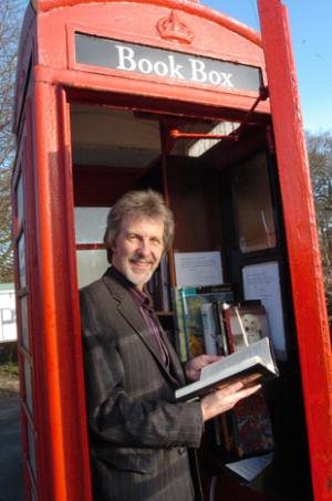
In January 2010, The Northwich Guardian reported on one opening, members of the parish council jumped at the chance to take over the old phone box when BT were going to decommission it.

They even managed to improve on the traditional library:-
“And the great thing is, they don't have to worry about return dates, which makes it even better than a traditional library.”
Five staggered shelves, with an initial book count of 60.

6. Apethorpe, Cambridgeshire

In the first few months of 2011, The Apethorpe News blog was reporting on the plans to open a phonebox library there. There was plea for books and DVDs, but no new news since March.

Google maps just shows a regular phone box with no evidence of books, so who knows.

7. Point, Truro

The BBC had a video report in March 2011 for the 'book stop' in Point, near Truro, which has been established in response to the mobile library service only coming round every two weeks

Five quite bulky shelves taking up a lot of internal space, only four with books, possibly some more squeezed on top. No sign of children's books box.

8. Feock, Truro

At the end of March, the In The Kernow site has a video report and the Point library and a similar one in Feock, mentioning a launch party at the start of April.

From the video it looks like this has far better shelving than Point's, around six shelves, with a audio-cassette rack too, not sure how many books though

9. Staplehay, Somerset
In the middle of April, the Somerset County Gazette reported on a phone box library opening in Staplehay, which would have been opening on the 18th of April by a councillor from Westbury-Sub-Mendip, as it was directly inspired by. They're proud of the fact that whilst local libraries are reducing their opening hours, the phone box is available 24 hours a day.

Four shelves and a magazine rack, extra points for having a notice board too

10. Horsley, Surrey

At the end of May the BBC reported on one in operation in Horsley, Surrey.

Its more of a guerilla phone box/library conversion compared to the others, less of a community involvement and more of a lone eccentric. In the BBC piece it reports that BT have no knowledge of this one.

Does this even count, looks more like someone hiding rude books I guess it could count as four shelves, but its a bit half-arsed.

11. Little Shelford, Cambridgeshire

A few weeks ago the parish council website for Little Shelford in Cambridgeshire featured a piece on their phonebox library, explaining how to use it, including the vital feedback loop

...for really popular books, if you see a book you fancy reading one time you visit and the next time it’s gone, make a note on the Post-it pad and stick it on the window asking for it to be returned as soon as the last borrower has finished reading it (in other words ‘swopped back into stock’) so that you can get your hands on it. That way the person who borrowed it will know that it is in some demand.
It looks like a clearly laid out box, four shelves of books, one shelf that looks empty and a box for children's books.

12. Thruxton, Hampshire

In the absence of any photo of the Thruxton phonebox library as reported in This Is Hampshire a few weeks ago, I thought I would go for a wee drive in the country and check it out for myself. The weather was glorious, the sky all blue and roasty toasty. We came off mighty A303, weaved our way through some narrow country lanes and there it was before us, Thruxton's own phone box library. We were told by a villager stood nearby that it had been open for about six weeks and it took a while but they've got the balance between people dropping off books and picking up new one's just right.

Its a solid three shelf affair with excess books stacked on top of the top shelf. I left a some feminist books and a Bill Drummond autobiography.

13. Shirley, Derbyshire

The one in Shirley Derbyshire is a bit of an odd story, apparently the council bought it in 2009, but it took until June 2011 for the BBC to report on it. Some neat quotes in the article though
Bill Ellis, from Shirley Parish Council, said: "Even we can stretch to a quid and so it was bought."

The Ashbourne News Telegraph has the interesting tiot-bit that the phonebox library has really taken off even though the village being serviced by a mobile library.

At least seven shelves on two sides, containing 250 books, and childrens books and DVDs.

And others:-
  • Coxley, Somerset
  • Dinder, Somerset
  • West and East Horrington, Somerset
  • Blagdon, Bristol
  • Tollerton, Nottingham
  • Timsbury, Bath
Here's a map I put together showing the approximate locations across England

View Phone box libraries in a larger map

Sure, this is all mostly as a result of BT's Adopt a Kiosk scheme and a lot of them might be little more than a book exchange scheme, more akin to finding a book left on a park bench, but these are very real examples of 'the local community' doing it for themselves.

Is there a disconnect between what professional librarians say are the services provided by libraries, somewhere quiet to read and do homework, free internet access, someone to point them in the right direction for research, etc, and what the local community want as a library which by way of phone box libraries is just access to different books?

There's three angles at work here:-
  • There's the state by way of democratically elected national government and local councils who have decided to cut back on and centralise library services as a cost saving in preferences to other things that could be cut.
  • There's the state by way of the appointed professional librarians who are paid for their expertise in librarianship who want to stop the cuts and ensure that the wider services provided by libraries are retained
  • and finally there's the state by way of people in local communities, who, regardless of other provisions and decisions elsewhere, identify the need and then establish the phone box libraries.