Dear friends,
I am a little sad that Apple has discontinued the iPod Classic.
It was their decision, and I'm sure they gave it a great deal of thought and weighed up all the pros and cons, and to them it made sense. But I think it's a mistake.
I think it marks the end of portable offline music playback. That's progress I guess.
I just liked having my entire music collection in my pocket, with a battery that lasts weeks rather than hours, ready for action without taking my eyes off the road. My mobile phone can't match that.
Maybe it opens up the market for small competitors to develop a terabyte portable media player, the TeraPod, but I'll have to wait for that to happen and it's going to take years.
Although iPods last for ever, I'm on my fourth, after previous ones were lost, stolen or affectionately given away. Anything could happen before the market provides a decent alternative for me.
Its not about me, its about Apple, with their business plan, their iPads and iWatches, their world has moved away from me.
So, me and Apple will soldier on, muddle through as best we can, with a little sadness, and nostalgia for the way things used to be, and the cool things we could do, maybe one day I'll get an iPhone or an iPad Mini.
I'm a little skeptical about the iWatch, I haven't had a wrist-mounted device for twenty years, and I thought that was progress. I can only wait and see if Apple were right.
All my love,
Your friend
Chris
Thursday 11 September 2014
Monday 4 November 2013
Homemade gps plot of London
One of the limitations of www.gpsvisualizer.com is that it has an upper limit on the filesize of the raw GPS traces of 3mb. The log of treks across London reached this data limit at the start of last week, and whilst there were some measures I could take to reduce the size, it was unsatisfying and a better solution was required.
 Using my bare ninja skillz I wrote a script in perl that processed the raw gps data from a txt file and then generated a png image file from scratch.
perl script
Larger version of map
AllTraces file
Writing the script myself allowed me to more finely control what was being plotted. One of the first things I added to the plot was a grid. This was simply done by creating a txt file with the coordinates and then drawing them as lines rather than points.
grid file
As well as gps traces of my walking routes across London I'm also tracking routes that I travelled on public transport and by car. These are plotted in red.
vehicle log file
One of the problems I've encountered and not satisfactorily addressed is that the gps coordinates are latitude and longitude, which because the world isn't flat, don't have a consistent aspect ratio. As you go further north from the equator the latitude ought to get closer together. This is why the grid squares are rectangular. If I lived in sunnier climes they would be more square.
As I'm mostly wandering round one city on the surface of the earth I can approximate a fixed aspect ratio. Although I could really do with getting my head round a better formula, something to do with the radians and the cosines.
Using my bare ninja skillz I wrote a script in perl that processed the raw gps data from a txt file and then generated a png image file from scratch.perl script
Larger version of map
AllTraces file
Writing the script myself allowed me to more finely control what was being plotted. One of the first things I added to the plot was a grid. This was simply done by creating a txt file with the coordinates and then drawing them as lines rather than points.
grid file
As well as gps traces of my walking routes across London I'm also tracking routes that I travelled on public transport and by car. These are plotted in red.
vehicle log file
One of the problems I've encountered and not satisfactorily addressed is that the gps coordinates are latitude and longitude, which because the world isn't flat, don't have a consistent aspect ratio. As you go further north from the equator the latitude ought to get closer together. This is why the grid squares are rectangular. If I lived in sunnier climes they would be more square.
As I'm mostly wandering round one city on the surface of the earth I can approximate a fixed aspect ratio. Although I could really do with getting my head round a better formula, something to do with the radians and the cosines.
Tuesday 17 September 2013
London Walking GPS Trace
At weekends, odd days off work and occasionally in the evenings, I have spent the past three years wandering and running round London.
To make this trace image I use an Android app called Endomondo to track my position and speed when I'm out strolling, and to log my fitness stats online. From the Endomondo website I can download the GPS traces of individual routes as GPX files.
Then I use a website called GPSVisualizer to merge all my GPX files into a single plain text .txt file, this format keeps the filesize small. Then I can use GPSVisualizer to create the trace image from the txt file. This big image which is essentially my walking map of London.
GPSVisualizer limits the image size to 4000pix in its smallest dimension, and the input GPS files are limited to 3 megabytes.
To the north has me following the River Lea to Waltham Abbey and the M25. To the west is my old place of work, Merit House on Edgware Road, Colindale, and in the south west of the map is my current place of work, in Harlesden, reached by way of the Grand Union Canal.
At the bottom of the map you will probably recognise the shape of the Thames. The big cross like structure in the middle of the map is Dalston junction.
Pretty neat, huh?
 |
| London walks 2011 to 2013 |
Then I use a website called GPSVisualizer to merge all my GPX files into a single plain text .txt file, this format keeps the filesize small. Then I can use GPSVisualizer to create the trace image from the txt file. This big image which is essentially my walking map of London.
GPSVisualizer limits the image size to 4000pix in its smallest dimension, and the input GPS files are limited to 3 megabytes.
To the north has me following the River Lea to Waltham Abbey and the M25. To the west is my old place of work, Merit House on Edgware Road, Colindale, and in the south west of the map is my current place of work, in Harlesden, reached by way of the Grand Union Canal.
At the bottom of the map you will probably recognise the shape of the Thames. The big cross like structure in the middle of the map is Dalston junction.
Pretty neat, huh?
Tuesday 9 July 2013
Choropleth map of change in mean rent in London boroughs
Please find below a choropleth map of mean average rents for two bedroom properties in London boroughs have changed between July 2012 and July 2013.
Data taken from rightmove.co.uk, choropleth map designed by C.D.Gilmour
Choropleth maps of London Boroughs
Please find below a choropleth map the population densities in the various London boroughs.
After wasting too much time colouring in maps using MS Paint, I thought there must be an easier way, so I had a go at drawing a stylised map of London borough using SVG.
Most of free svg maps online used paths to trace each borough, I wanted polygons so I had to draw it from scratch.
The population densities are calculated from wikipedia figures from the 2011 census.
I've used html titles for the tooltips.
The map renders fine in Chrome 27.0.1453.116, not at all in internet explorer 9.0.8112, haven't tried it in Firefox.
I'm not sure about the colour scheme, greyscale looks okay for the time being. Any suggestions and critique would be gratefully received.
Sunday 7 July 2013
London rents and advertised properties revisited
Continuing my series of blogposts looking at the vagaries of the average rents in London, this time with even more fancy graphs.
I'm not trying to make any arguments or be judgmental, I'm just playing around with a dataset, trying squeeze out as much information as possible, look for any interesting patterns, speculate on their causes and then looking for evidence.
Let me remind long term readers of this blog that I get my data from the rightmove.co.uk website, searching for how many two bedroom properties there are in each London borough at various price points. This allows me to calculate the average rent for two bedroom properties on the market in each borough and then generate a graph like this one for July 2013 so far.

Broadly we can see that boroughs with lots of two bedroom properties have higher rents than boroughs with few two bedroom properties on the market.
Somewhat predictably Westminster, as the UK's seat of power, has the highest average rents, closely followed by the perhaps the most high-end shopping district in the world, Kensington and Chelsea.
 For a few moments I thought that there was a correlation between the size of the borough in terms of population and the number of two bedroom rental properties on the market. I ran a graph using the population estimates from wikipedia from the 2011 census and average number of properties per month for the last 14 months.
There's not much of a correlation. You can't say that boroughs with a smaller population have fewer properties available, or vice versa. Kensington and Kingston have about the same population, 160,000, but the former has around five times as many properties available. Richmond and Barnet have about the same number of available properties, but the former has half the population of the latter.
Even a trend line in Excel is just about flat.
 Its possible that if you split the boroughs on the chart into two groups you could get some nice correlated lines. I had a go using the categories of inner London and outer London boroughs, but it wasn't very satisfactory.
There was some degree of correlation between borough population for inner London boroughs, but outer London was pretty much flat, and there was quite an overlap between the two categories.
At this point I should perhaps list a few assumptions:-
 Let me explain the example Inksplatter chart to the right. On it are the average rents, and number of two bedroom rental properties each month for four different boroughs. The smaller the dot, the further in the past the datapoint is. The larger the dot the more recent the datapoint is.
We can easily see the direction of change for each borough:-

In retrospect, this chart fails in that its not very easy to see what's going on, its very poor at conveying information. However, there are bits and bobs we can discern from it:-
Zooming into specific boroughs displayed on the chart elucidates some more interesting trends

Here we can see the following:-
Stepping away from the Inksplatter charts, it would be illuminating to categories all 33 London boroughs, into the four groups, 'Social good', 'Boom', 'Social bad' and 'Bust'
Does this sound right?
I don't know
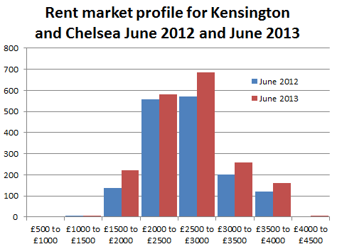
Anyhoo back to the Londonist / London Councils and their claim that in Kensington and Chelsea the lower quartile rents have gone up by £260 between January 2012 and January 2013

By my reckoning average rents there are around £2900 per month. I don't have exact figures on what the median, lower and upper quartile rents are, but I do have figures for how many two bedroom properties were listed on Rightmove in June 2012 and June 2013.
Last year in June there were 1,800 two bedroom properties listed and now there are 2,400 of them, so that's a 30% increase in the number of propertied advertised. We can see from the graph on the right that this increase wasn't evenly spread across the spectrum of price points. It looks like there was actually an increase in the number of lower end properties available, although in Kensington and Chelsea the lower end is still £1500 to £2000 per month. The other increase seems to be in the upper end, and hardly any increase in median priced properties.
I reckon that the Londonist's quoted £260 increase is more of a statistical anomaly from the change in the profile, and the increase in properties available, rather than there being fewer cheap properties available.
To finish off this piece a few quartile monthly rents statistics for all of London:-
One bedroom properties
Lower quartile - Between £1,100 and £1,200 per month
Median - Between £1,400 and £1,500 per month
Upper quartile - Between £1,800 and £1,900 per month
Two bedroom properties
Lower quartile - Between £1,500 and £1,600 per month
Median - Between £1,800 and £1,900 per month
Upper quartile - Between £2,500 and £2,600 per month
Three bedroom properties
Lower quartile - Between £1,600 and £1,700 per month
Median - Between £2,200 and £2,300 per month
Upper quartile - Between £3,000 and £3,100 per month

I'm not trying to make any arguments or be judgmental, I'm just playing around with a dataset, trying squeeze out as much information as possible, look for any interesting patterns, speculate on their causes and then looking for evidence.
Let me remind long term readers of this blog that I get my data from the rightmove.co.uk website, searching for how many two bedroom properties there are in each London borough at various price points. This allows me to calculate the average rent for two bedroom properties on the market in each borough and then generate a graph like this one for July 2013 so far.

Broadly we can see that boroughs with lots of two bedroom properties have higher rents than boroughs with few two bedroom properties on the market.
Somewhat predictably Westminster, as the UK's seat of power, has the highest average rents, closely followed by the perhaps the most high-end shopping district in the world, Kensington and Chelsea.
 For a few moments I thought that there was a correlation between the size of the borough in terms of population and the number of two bedroom rental properties on the market. I ran a graph using the population estimates from wikipedia from the 2011 census and average number of properties per month for the last 14 months.
There's not much of a correlation. You can't say that boroughs with a smaller population have fewer properties available, or vice versa. Kensington and Kingston have about the same population, 160,000, but the former has around five times as many properties available. Richmond and Barnet have about the same number of available properties, but the former has half the population of the latter.
Even a trend line in Excel is just about flat.

There was some degree of correlation between borough population for inner London boroughs, but outer London was pretty much flat, and there was quite an overlap between the two categories.
At this point I should perhaps list a few assumptions:-
- Two bedroom rental properties on the market as a proxy for the all rental properties on the market
It takes an hour or two to scrape the data, in order to check other property types would be beyond the limited of my concentration. Once I did scrape the data for one bedroom properties and the shape of the graph was much the same as the graph for two bedroom, so I took this to mean its a valid proxy. - Rightmove.co.uk as a proxy for the entire London rental market
Clearly there are other sources, Gumtree, and individual property management sites. And clearly each other source will cover a slightly different section of the market. Gumtree covering the lower end where the rents don't justify the advertising cost, and high end rental agencies coping for the elite and exclusive. At anyone time Rightmove.co.uk has around 30,000 two bedroom rental properties in the London area. - Mean average rent as a proxy for the shape of the borough's entire market
I've had discussions about whether the mean is valid compared to the median, and over on the Londonist site there go so far as to discuss the upper and lower quartiles for each borough. These I could calculate, but it's beyond my attention span to do regularly and I feel there's something a little dishonest about it, it gives more ammunition to cherry pick data that supports specific arguments. - Properties advertised on the market as a proxy for actual rents
This is a problem I've run into when comparing my data with other people's. Whilst the average rent advertised on Rightmove may increase in a borough, it doesn't follow that every person in that borough's rent suddenly increases, that landlord go knocking on every door and put the rent up, in fact, that's a little illegal. Other data mongers, such as LSL Property use a sample of a few thousand buy to let landlords to calculate their index, that may be appropriate for sitting residents, but for someone who is looking to move, its not so good. - The rental properties advertised on the market as a proxy for all rents - This one perhaps undermines it all. What does it mean that in Richmond last summer there were 450 two bedroom properties advertised, and this summer there are three times as many. Are people leaving Richmond in droves, leaving landlords grasping for new tenants, or are developers quickly building hundreds of new buy to let properties? Is it possible to tell from the available data? I don't know
 Let me explain the example Inksplatter chart to the right. On it are the average rents, and number of two bedroom rental properties each month for four different boroughs. The smaller the dot, the further in the past the datapoint is. The larger the dot the more recent the datapoint is.
We can easily see the direction of change for each borough:-
- Borough A is moving to the north west of the graph, this means that average rents are decreasing and the number of properties is increasing. In answer to the complaint that there aren't enough properties and rents are too high, I will call this type of behaviour 'Socially Good'.
- Borough B is moving to the north east of the chart, rents are increase, and properties available are increasing. For landlords and property management I call this behaviour 'Boom'.
- Borough C is moving south east, rents are increasing, but the available pool of property is drying up, I call this 'Socially Bad'.
- and finally with Borough D, average rents are falling and the the number of properties is decreasing, this is 'Bust'

In retrospect, this chart fails in that its not very easy to see what's going on, its very poor at conveying information. However, there are bits and bobs we can discern from it:-
- The City of London has had a wide range of average rents over the period, but the number of properties advertised barely changes.
- In Tower Hamlets, the average rent drifts about just over £2000 per month, but the number of properties advertised drifts between 3000 and 3500, with no discernible trend
- In Camden, the number of properties has increased from 1400 to just shy of 2000, with the average rent staying consistent until the last month, where average rents appear to fall by around £100
Zooming into specific boroughs displayed on the chart elucidates some more interesting trends

Here we can see the following:-
- Southwark and Richmond are both displaying 'Social good' behaviour, in that the drift is to the north west, that is, more properties and lower average rents.
- Hammersmith and Fulham is display the same trend, but with a smaller increase in properties.
- Lambeth and Wandsworth are both displaying 'Boom' like behaviour with increasing average rents with but small increases in properties
- Hackney was displaying a 'Boom' trend until the last month where average rents fell
Stepping away from the Inksplatter charts, it would be illuminating to categories all 33 London boroughs, into the four groups, 'Social good', 'Boom', 'Social bad' and 'Bust'
Social good
|
Boom
|
Social Bad
|
Bust
|
| Hammersmith | Barnet | Barking | City of London |
| Kingston Upon Thames | Brent | Bexley | Tower Hamlets |
| Lambeth | Camden | Bromley | |
| Lewisham | Croydon | Enfield | |
| Newham | Ealing | Havering | |
| Richmond | Greenwich | ||
| Wandsworth | Hackney | ||
| Haringey | |||
| Harrow | |||
| Hillingdon | |||
| Hounslow | |||
| Islington | |||
| Kensington | |||
| Merton | |||
| Redbridge | |||
| Southwark | |||
| Sutton | |||
| Waltham Forest | |||
| Westminster |
Does this sound right?
I don't know
Anyhoo back to the Londonist / London Councils and their claim that in Kensington and Chelsea the lower quartile rents have gone up by £260 between January 2012 and January 2013
By my reckoning average rents there are around £2900 per month. I don't have exact figures on what the median, lower and upper quartile rents are, but I do have figures for how many two bedroom properties were listed on Rightmove in June 2012 and June 2013.
Last year in June there were 1,800 two bedroom properties listed and now there are 2,400 of them, so that's a 30% increase in the number of propertied advertised. We can see from the graph on the right that this increase wasn't evenly spread across the spectrum of price points. It looks like there was actually an increase in the number of lower end properties available, although in Kensington and Chelsea the lower end is still £1500 to £2000 per month. The other increase seems to be in the upper end, and hardly any increase in median priced properties.
I reckon that the Londonist's quoted £260 increase is more of a statistical anomaly from the change in the profile, and the increase in properties available, rather than there being fewer cheap properties available.
To finish off this piece a few quartile monthly rents statistics for all of London:-
One bedroom properties
Lower quartile - Between £1,100 and £1,200 per month
Median - Between £1,400 and £1,500 per month
Upper quartile - Between £1,800 and £1,900 per month
Two bedroom properties
Lower quartile - Between £1,500 and £1,600 per month
Median - Between £1,800 and £1,900 per month
Upper quartile - Between £2,500 and £2,600 per month
Three bedroom properties
Lower quartile - Between £1,600 and £1,700 per month
Median - Between £2,200 and £2,300 per month
Upper quartile - Between £3,000 and £3,100 per month

Thursday 23 May 2013
Londonland rents - the average
This London rent thing has been bugging me for a week or so. I was going to
let it go, but last night þere was a piece on whatever BBC news program
about gentrification in Brixton and how rising rents were forcing out
the natives, so market traders were getting people buying fruit and veg
like they used to in the old days.
Brixton is part of Lambeth.
Still, their report on rents has been very successful in the media, with coverage in The Evening Standard, The Independent and the BBC.
A little too successful perhaps, its quite a specific report for a small niche, buy-to-let investors who want someone else to manage their property. The report is good for the sort of returns investor can hope to receive, and its good for whipping up hysteria about the market, less so for people looking to rent.
Average London rent
The other headline factoid in the LSL report is that 'average' rents in London have reached an all-time high of £1,110 per month. Maybe it is for the properties that they manage, but no explanation of what sort of properties that refers to, residential or industrial, how many bedrooms or whereabouts. For buy-to-let investors, the intended audience for the LSL it doesn't really matter, but for people looking to rent in London, its more significant.
Its misleading.
For people actually looking for somewhere to live, for somewhere to rent, the mean average two bedroom rent is £1,957 per month, the median two bedroom rent is about £1,925
For one bedroom flats, the mean average monthly rent is £1,617, the median is about £1,475.
As has been pointed out previously the spread of rents is a bit skewed, þere aren't many cheap places, but þere's no limit to how much you can pay.
Here's a chart showing the market profile in London for one- and two bedroom properties

Despite the high demand for cheap / affordable housing in London, the market seems unable to offer many two bedroom places below £1,000 a month.
Market distortions
Brixton
On the one hand I feel for the fruit and veg sellers, on the other hand (like Iron Man might say) businesses go out of business all the time, þere's no need to be a pussy about it. But with pieces on the BBC, something didn't feel right.
Rents going up, rich people moving in, the native population being forced out due to rising rents, that's the general line from the BBC.
Rents going up, rich people moving in, the native population being forced out due to rising rents, that's the general line from the BBC.
Brixton is part of Lambeth.
According to figures scraped from rightmove.com
average rents in Lambeth for two bedroom properties have fallen by
about 3% between May 2012 and May 2013, from £1,745 to £1,695 per month for a two bedroom property. This is mainly because þere are around 17% more properties on the market þere, for two bedroom properties þere were 830 this time last year and þere are 970 this year.
Its possible that
average rents in Brixton have risen, but in the rest of Lambeth have
fallen even more so, so the borough average is down, but its unlikely.
Likewise, its possible that average rents for properties with more or
fewer than two bedrooms have risen disproportionately to two bedroom
properties, but its unlikely. So either my figures are wrong or the
figures the BBC used are wrong.
Falling rents
At this point, I'd like to veer off and discuss the
nature of rents. For individuals, rents hardly ever come down, your
landlord is only ever going to keep the rent you pay the same or they'll
raise it. If for example their mortgage rate falls, they're not going
to voluntarily pass the reduction on to their tenants. Pretty much the
only occasion where an individual rent will fall is if the tenant has a
change of circumstance: "sorry guv' I lost my job and the missus is up
the duff, we're going to have to move out if you don't reduce the rent, an' we've always been such good tenants, and never caused no one no bother."
For properties, rents do come down, if they're sat
empty on the market for a while the landlord might offer a lower rent,
that is, if þere is no demand at one price point. Or if the property
has turned crap, developed faults, got fucked up by the previous tenants or is in need of modernisation, the rent
may fall, or if the area has become crap. But this only happens if the
property is empty.
For average rents in a specific area, average rents
could fall only if þere are a lot of empty properties on the market, or
if new properties have been brought to market.
So if an an area is in decline, or if a lot of people for some reason have decided to invest selflessly creating in low value housing, for very low returns.
Anyhoo, with these points in mind, for the rest of the
article when I refer to rents falling or rising, I mean in general, on
average for two bedroom properties that are on the market and not secret.
I live in a nice flat in Walthamstow, it has two bedrooms
and a garden and I pay £800 per month. The rent hasn't changed for
three years, despite the average rising by £50.
LSL Property Services
Moving on. At the moment, whenever you search
twitter for 'London rents' þere are dozens of people fretting about news articles
that regurgitate a press release and paper by LSL Property Services,
with a headline factoid about London rents increasing by 7% year on
year.
This is at odds with the figures I scraped from Rightmove where London rents are up around 3%, broadly in line with
inflation and also highly variable within the London boroughs. Some are
down 3% some are up 7%, but broadly, they follow inflation.
I believe the methodology used by LSL and their consultants Wriglesworth, is to blame. We're looking at different things. Whilst I'm scraping the prices of every property listed on Rightmove for all of London, some 30,000 properties on the market, LSL use a sample of 18,000 properties from all over the UK with tenants currently paying rent.
Its like I said earlier about how my rent hasn't changed but the rental market in Walthamstow has gone way higher.
LSL split their sample of 18,000 properties into 11 regions in England and Wales which suggests a sample size of between 1,600 to 2,600 properties per region. For London this could amount to a sample of between 50 and 100 properties per borough, covering all property sizes, one bedroom, two bedroom and more.
Tower Hamlets has 3,000 two bedroom properties on the market, so maybe an order of magnitude more than that with sitting tenants which LSL are trying to model. I believe LSL's sample size is a bit small for the level of accuracy they proclaim. But hey, we're counting different things.
Maybe, like political polling companies, they're have a really well crafted representative sample of rental properties. Maybe
Still, their report on rents has been very successful in the media, with coverage in The Evening Standard, The Independent and the BBC.
A little too successful perhaps, its quite a specific report for a small niche, buy-to-let investors who want someone else to manage their property. The report is good for the sort of returns investor can hope to receive, and its good for whipping up hysteria about the market, less so for people looking to rent.
Average London rent
The other headline factoid in the LSL report is that 'average' rents in London have reached an all-time high of £1,110 per month. Maybe it is for the properties that they manage, but no explanation of what sort of properties that refers to, residential or industrial, how many bedrooms or whereabouts. For buy-to-let investors, the intended audience for the LSL it doesn't really matter, but for people looking to rent in London, its more significant.
Its misleading.
For people actually looking for somewhere to live, for somewhere to rent, the mean average two bedroom rent is £1,957 per month, the median two bedroom rent is about £1,925
For one bedroom flats, the mean average monthly rent is £1,617, the median is about £1,475.
As has been pointed out previously the spread of rents is a bit skewed, þere aren't many cheap places, but þere's no limit to how much you can pay.
Here's a chart showing the market profile in London for one- and two bedroom properties

Despite the high demand for cheap / affordable housing in London, the market seems unable to offer many two bedroom places below £1,000 a month.
Market distortions
It is my belief that Housing Benefit, in London, artificially distorts the market and provides a rent floor below which no properties are available at any standard, be they rat infested, moldy or just really small, all are available for £1,000 or more.
This means that anything not rat infested, moldy or really small is on the market for a lot more than £1,000.
I'm not sure how to demonstrate or prove this market distortion, but perhaps playing round with the data some more will help.

So, despite demand and all the bluster from politicians, the number of two bedroom properties on the market London for lets than £1,000 a month has fallen.

So, despite demand and all the bluster from politicians, the number of two bedroom properties on the market London for lets than £1,000 a month has fallen.
Subscribe to:
Posts (Atom)