I'm not trying to make any arguments or be judgmental, I'm just playing around with a dataset, trying squeeze out as much information as possible, look for any interesting patterns, speculate on their causes and then looking for evidence.
Let me remind long term readers of this blog that I get my data from the rightmove.co.uk website, searching for how many two bedroom properties there are in each London borough at various price points. This allows me to calculate the average rent for two bedroom properties on the market in each borough and then generate a graph like this one for July 2013 so far.

Broadly we can see that boroughs with lots of two bedroom properties have higher rents than boroughs with few two bedroom properties on the market.
Somewhat predictably Westminster, as the UK's seat of power, has the highest average rents, closely followed by the perhaps the most high-end shopping district in the world, Kensington and Chelsea.
 For a few moments I thought that there was a correlation between the size of the borough in terms of population and the number of two bedroom rental properties on the market. I ran a graph using the population estimates from wikipedia from the 2011 census and average number of properties per month for the last 14 months.
There's not much of a correlation. You can't say that boroughs with a smaller population have fewer properties available, or vice versa. Kensington and Kingston have about the same population, 160,000, but the former has around five times as many properties available. Richmond and Barnet have about the same number of available properties, but the former has half the population of the latter.
Even a trend line in Excel is just about flat.

There was some degree of correlation between borough population for inner London boroughs, but outer London was pretty much flat, and there was quite an overlap between the two categories.
At this point I should perhaps list a few assumptions:-
- Two bedroom rental properties on the market as a proxy for the all rental properties on the market
It takes an hour or two to scrape the data, in order to check other property types would be beyond the limited of my concentration. Once I did scrape the data for one bedroom properties and the shape of the graph was much the same as the graph for two bedroom, so I took this to mean its a valid proxy. - Rightmove.co.uk as a proxy for the entire London rental market
Clearly there are other sources, Gumtree, and individual property management sites. And clearly each other source will cover a slightly different section of the market. Gumtree covering the lower end where the rents don't justify the advertising cost, and high end rental agencies coping for the elite and exclusive. At anyone time Rightmove.co.uk has around 30,000 two bedroom rental properties in the London area. - Mean average rent as a proxy for the shape of the borough's entire market
I've had discussions about whether the mean is valid compared to the median, and over on the Londonist site there go so far as to discuss the upper and lower quartiles for each borough. These I could calculate, but it's beyond my attention span to do regularly and I feel there's something a little dishonest about it, it gives more ammunition to cherry pick data that supports specific arguments. - Properties advertised on the market as a proxy for actual rents
This is a problem I've run into when comparing my data with other people's. Whilst the average rent advertised on Rightmove may increase in a borough, it doesn't follow that every person in that borough's rent suddenly increases, that landlord go knocking on every door and put the rent up, in fact, that's a little illegal. Other data mongers, such as LSL Property use a sample of a few thousand buy to let landlords to calculate their index, that may be appropriate for sitting residents, but for someone who is looking to move, its not so good. - The rental properties advertised on the market as a proxy for all rents - This one perhaps undermines it all. What does it mean that in Richmond last summer there were 450 two bedroom properties advertised, and this summer there are three times as many. Are people leaving Richmond in droves, leaving landlords grasping for new tenants, or are developers quickly building hundreds of new buy to let properties? Is it possible to tell from the available data? I don't know
 Let me explain the example Inksplatter chart to the right. On it are the average rents, and number of two bedroom rental properties each month for four different boroughs. The smaller the dot, the further in the past the datapoint is. The larger the dot the more recent the datapoint is.
We can easily see the direction of change for each borough:-
- Borough A is moving to the north west of the graph, this means that average rents are decreasing and the number of properties is increasing. In answer to the complaint that there aren't enough properties and rents are too high, I will call this type of behaviour 'Socially Good'.
- Borough B is moving to the north east of the chart, rents are increase, and properties available are increasing. For landlords and property management I call this behaviour 'Boom'.
- Borough C is moving south east, rents are increasing, but the available pool of property is drying up, I call this 'Socially Bad'.
- and finally with Borough D, average rents are falling and the the number of properties is decreasing, this is 'Bust'

In retrospect, this chart fails in that its not very easy to see what's going on, its very poor at conveying information. However, there are bits and bobs we can discern from it:-
- The City of London has had a wide range of average rents over the period, but the number of properties advertised barely changes.
- In Tower Hamlets, the average rent drifts about just over £2000 per month, but the number of properties advertised drifts between 3000 and 3500, with no discernible trend
- In Camden, the number of properties has increased from 1400 to just shy of 2000, with the average rent staying consistent until the last month, where average rents appear to fall by around £100
Zooming into specific boroughs displayed on the chart elucidates some more interesting trends

Here we can see the following:-
- Southwark and Richmond are both displaying 'Social good' behaviour, in that the drift is to the north west, that is, more properties and lower average rents.
- Hammersmith and Fulham is display the same trend, but with a smaller increase in properties.
- Lambeth and Wandsworth are both displaying 'Boom' like behaviour with increasing average rents with but small increases in properties
- Hackney was displaying a 'Boom' trend until the last month where average rents fell
Stepping away from the Inksplatter charts, it would be illuminating to categories all 33 London boroughs, into the four groups, 'Social good', 'Boom', 'Social bad' and 'Bust'
Social good
|
Boom
|
Social Bad
|
Bust
|
| Hammersmith | Barnet | Barking | City of London |
| Kingston Upon Thames | Brent | Bexley | Tower Hamlets |
| Lambeth | Camden | Bromley | |
| Lewisham | Croydon | Enfield | |
| Newham | Ealing | Havering | |
| Richmond | Greenwich | ||
| Wandsworth | Hackney | ||
| Haringey | |||
| Harrow | |||
| Hillingdon | |||
| Hounslow | |||
| Islington | |||
| Kensington | |||
| Merton | |||
| Redbridge | |||
| Southwark | |||
| Sutton | |||
| Waltham Forest | |||
| Westminster |
Does this sound right?
I don't know
Anyhoo back to the Londonist / London Councils and their claim that in Kensington and Chelsea the lower quartile rents have gone up by £260 between January 2012 and January 2013
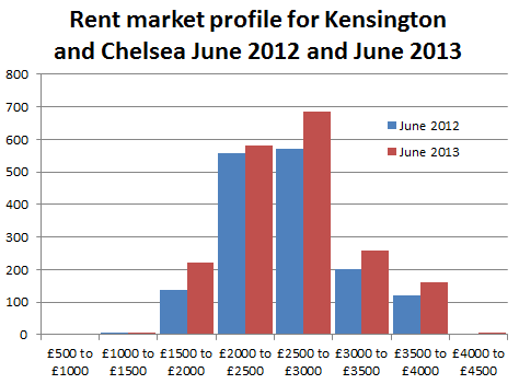
By my reckoning average rents there are around £2900 per month. I don't have exact figures on what the median, lower and upper quartile rents are, but I do have figures for how many two bedroom properties were listed on Rightmove in June 2012 and June 2013.
Last year in June there were 1,800 two bedroom properties listed and now there are 2,400 of them, so that's a 30% increase in the number of propertied advertised. We can see from the graph on the right that this increase wasn't evenly spread across the spectrum of price points. It looks like there was actually an increase in the number of lower end properties available, although in Kensington and Chelsea the lower end is still £1500 to £2000 per month. The other increase seems to be in the upper end, and hardly any increase in median priced properties.
I reckon that the Londonist's quoted £260 increase is more of a statistical anomaly from the change in the profile, and the increase in properties available, rather than there being fewer cheap properties available.
To finish off this piece a few quartile monthly rents statistics for all of London:-
One bedroom properties
Lower quartile - Between £1,100 and £1,200 per month
Median - Between £1,400 and £1,500 per month
Upper quartile - Between £1,800 and £1,900 per month
Two bedroom properties
Lower quartile - Between £1,500 and £1,600 per month
Median - Between £1,800 and £1,900 per month
Upper quartile - Between £2,500 and £2,600 per month
Three bedroom properties
Lower quartile - Between £1,600 and £1,700 per month
Median - Between £2,200 and £2,300 per month
Upper quartile - Between £3,000 and £3,100 per month

No comments:
Post a Comment