Showing posts with label commentary. Show all posts

Sunday, 7 July 2013

London rents and advertised properties revisited

Continuing my series of blogposts looking at the vagaries of the average rents in London, this time with even more fancy graphs.

I'm not trying to make any arguments or be judgmental, I'm just playing around with a dataset, trying squeeze out as much information as possible, look for any interesting patterns, speculate on their causes and then looking for evidence.

Let me remind long term readers of this blog that I get my data from the rightmove.co.uk website, searching for how many two bedroom properties there are in each London borough at various price points. This allows me to calculate the average rent for two bedroom properties on the market in each borough and then generate a graph like this one for July 2013 so far.


Broadly we can see that boroughs with lots of two bedroom properties have higher rents than boroughs with few two bedroom properties on the market.

Somewhat predictably Westminster, as the UK's seat of power, has the highest average rents, closely followed by the perhaps the most high-end shopping district in the world, Kensington and Chelsea.

For a few moments I thought that there was a correlation between the size of the borough in terms of population and the number of two bedroom rental properties on the market. I ran a graph using the population estimates from wikipedia from the 2011 census and average number of properties per month for the last 14 months.

There's not much of a correlation. You can't say that boroughs with a smaller population have fewer properties available, or vice versa. Kensington and Kingston have about the same population, 160,000, but the former has around five times as many properties available. Richmond and Barnet have about the same number of available properties, but the former has half the population of the latter.

Even a trend line in Excel is just about flat.

Its possible that if you split the boroughs on the chart into two groups you could get some nice correlated lines. I had a go using the categories of inner London and outer London boroughs, but it wasn't very satisfactory.

There was some degree of correlation between borough population for inner London boroughs, but outer London was pretty much flat, and there was quite an overlap between the two categories.

At this point I should perhaps list a few assumptions:-
  • Two bedroom rental properties on the market as a proxy for the all rental properties on the market
    It takes an hour or two to scrape the data, in order to check other property types would be beyond the limited of my concentration. Once I did scrape the data for one bedroom properties and the shape of the graph was much the same as the graph for two bedroom, so I took this to mean its a valid proxy.
  • Rightmove.co.uk as a proxy for the entire London rental market
    Clearly there are other sources, Gumtree, and individual property management sites. And clearly each other source will cover a slightly different section of the market. Gumtree covering the lower end where the rents don't justify the advertising cost, and high end rental agencies coping for the elite and exclusive. At anyone time Rightmove.co.uk has around 30,000 two bedroom rental properties in the London area.
  • Mean average rent as a proxy for the shape of the borough's entire market
    I've had discussions about whether the mean is valid compared to the median, and over on the Londonist site there go so far as to discuss the upper and lower quartiles for each borough. These I could calculate, but it's beyond my attention span to do regularly and I feel there's something a little dishonest about it, it gives more ammunition to cherry pick data that supports specific arguments.
  • Properties advertised on the market as a proxy for actual rents
    This is a problem I've run into when comparing my data with other people's. Whilst the average rent advertised on Rightmove may increase in a borough, it doesn't follow that every person in that borough's rent suddenly increases, that landlord go knocking on every door and put the rent up, in fact, that's a little illegal. Other data mongers, such as LSL Property use a sample of a few thousand buy to let landlords to calculate their index, that may be appropriate for sitting residents, but for someone who is looking to move, its not so good.
  • The rental properties advertised on the market as a proxy for all rents - This one perhaps undermines it all. What does it mean that in Richmond last summer there were 450 two bedroom properties advertised, and this summer there are three times as many. Are people leaving Richmond in droves, leaving landlords grasping for new tenants, or are developers quickly building hundreds of new buy to let properties? Is it possible to tell from the available data? I don't know
As I've been tracking the number of properties and average rents for a while now, its possible to generate a graph showing how these things change of time. I wasn't quite sure how to do it, so I've invented what I'm going to call an Inksplatter chart which will show the four variables.

Let me explain the example Inksplatter chart to the right. On it are the average rents, and number of two bedroom rental properties each month for four different boroughs. The smaller the dot, the further in the past the datapoint is. The larger the dot the more recent the datapoint is.

We can easily see the direction of change for each borough:-
  • Borough A is moving to the north west of the graph, this means that average rents are decreasing and the number of properties is increasing. In answer to the complaint that there aren't enough properties and rents are too high, I will call this type of behaviour 'Socially Good'.
  • Borough B is moving to the north east of the chart, rents are increase, and properties available are increasing.  For landlords and property management I call this behaviour 'Boom'.
  • Borough C is moving south east, rents are increasing, but the available pool of property is drying up, I call this 'Socially Bad'.
  • and finally with Borough D, average rents are falling and the the number of properties is decreasing, this is 'Bust'
With this in mind, let me present an Inksplatter chart of the changes in average rent and available properties in London boroughs between May-2012 and July-2013


In retrospect, this chart fails in that its not very easy to see what's going on, its very poor at conveying information. However, there are bits and bobs we can discern from it:-

  • The City of London has had a wide range of average rents over the period, but the number of properties advertised barely changes.
  • In Tower Hamlets, the average rent drifts about just over £2000 per month, but the number of properties advertised drifts between 3000 and 3500, with no discernible trend
  • In Camden, the number of properties has increased from 1400 to just shy of 2000, with the average rent staying consistent until the last month, where average rents appear to fall by around £100

Zooming into specific boroughs displayed on the chart elucidates some more interesting trends


Here we can see the following:-
  • Southwark and Richmond are both displaying 'Social good' behaviour, in that the drift is to the north west, that is, more properties and lower average rents.
  • Hammersmith and Fulham is display the same trend, but with a smaller increase in properties.
  • Lambeth and Wandsworth are both displaying 'Boom' like behaviour with increasing average rents with but small increases in properties
  • Hackney was displaying a 'Boom' trend until the last month where average rents fell


Stepping away from the Inksplatter charts, it would be illuminating to categories all 33 London boroughs, into the four groups, 'Social good', 'Boom', 'Social bad' and 'Bust'

Social good
Boom
Social Bad
Bust
Hammersmith Barnet Barking City of London
Kingston Upon Thames Brent Bexley Tower Hamlets
Lambeth Camden Bromley
Lewisham Croydon Enfield
Newham Ealing Havering
Richmond Greenwich
Wandsworth Hackney
Haringey
Harrow
Hillingdon
Hounslow
Islington
Kensington
Merton
Redbridge
Southwark
Sutton
Waltham Forest
Westminster

Does this sound right?

I don't know

Anyhoo back to the Londonist / London Councils and their claim that in Kensington and Chelsea the lower quartile rents have gone up by £260 between January 2012 and January 2013
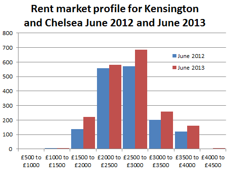
By my reckoning average rents there are around £2900 per month. I don't have exact figures on what the median, lower and upper quartile rents are, but I do have figures for how many two bedroom properties were listed on Rightmove in June 2012 and June 2013.

Last year in June there were 1,800 two bedroom properties listed and now there are 2,400 of them, so that's a 30% increase in the number of propertied advertised. We can see from the graph on the right that this increase wasn't evenly spread across the spectrum of price points. It looks like there was actually an increase in the number of lower end properties available, although in Kensington and Chelsea the lower end is still £1500 to £2000 per month. The other increase seems to be in the upper end, and hardly any increase in median priced properties.

I reckon that the Londonist's quoted £260 increase is more of a statistical anomaly from the change in the profile, and the increase in properties available, rather than there being fewer cheap properties available.

To finish off this piece a few quartile monthly rents statistics for all of London:-

One bedroom properties
Lower quartile - Between £1,100 and £1,200 per month
Median - Between £1,400 and £1,500 per month
Upper quartile - Between £1,800 and £1,900 per month

Two bedroom properties
Lower quartile - Between £1,500 and £1,600 per month
Median - Between £1,800 and £1,900 per month
Upper quartile - Between £2,500 and £2,600 per month

Three bedroom properties
Lower quartile - Between £1,600 and £1,700 per month
Median - Between £2,200 and £2,300 per month
Upper quartile - Between £3,000 and £3,100 per month

Thursday, 23 May 2013

Londonland rents - the average

This London rent thing has been bugging me for a week or so. I was going to let it go, but last night þere was a piece on whatever BBC news program about gentrification in Brixton and how rising rents were forcing out the natives, so market traders were getting people buying fruit and veg like they used to in the old days.

Brixton

On the one hand I feel for the fruit and veg sellers, on the other hand (like Iron Man might say) businesses go out of business all the time, þere's no need to be a pussy about it. But with pieces on the BBC, something didn't feel right.

Rents going up, rich people moving in, the native population being forced out due to rising rents, that's the general line from the BBC.

Brixton is part of Lambeth.

According to figures scraped from rightmove.com average rents in Lambeth for two bedroom properties have fallen by about 3% between May 2012 and May 2013, from £1,745 to £1,695 per month for a two bedroom property. This is mainly because þere are around 17% more properties on the market þere, for two bedroom properties þere were 830 this time last year and þere are 970 this year.

Its possible that average rents in Brixton have risen, but in the rest of Lambeth have fallen even more so, so the borough average is down, but its unlikely. Likewise, its possible that average rents for properties with more or fewer than two bedrooms have risen disproportionately to two bedroom properties, but its unlikely. So either my figures are wrong or the figures the BBC used are wrong.

Falling rents

At this point, I'd like to veer off and discuss the nature of rents. For individuals, rents hardly ever come down, your landlord is only ever going to keep the rent you pay the same or they'll raise it. If for example their mortgage rate falls, they're not going to voluntarily pass the reduction on to their tenants. Pretty much the only occasion where an individual rent will fall is if the tenant has a change of circumstance: "sorry guv' I lost my job and the missus is up the duff, we're going to have to move out if you don't reduce the rent, an' we've always been such good tenants, and never caused no one no bother."

For properties, rents do come down, if they're sat empty on the market for a while the landlord might offer a lower rent, that is, if þere is no demand at one price point. Or if the property has turned crap, developed faults, got fucked up by the previous tenants or is in need of modernisation, the rent may fall, or if the area has become crap. But this only happens if the property is empty.

For average rents in a specific area, average rents could fall only if þere are a lot of empty properties on the market, or if new properties have been brought to market.

So if an an area is in decline, or if a lot of people for some reason have decided to invest selflessly creating in low value housing, for very low returns.

Anyhoo, with these points in mind, for the rest of the article when I refer to rents falling or rising, I mean in general, on average for two bedroom properties that are on the market and not secret.

I live in a nice flat in Walthamstow, it has two bedrooms and a garden and I pay £800 per month. The rent hasn't changed for three years, despite the average rising by £50.

LSL Property Services

Moving on. At the moment, whenever you search twitter for 'London rents' þere are dozens of people fretting about news articles that regurgitate a press release and paper by LSL Property Services, with a headline factoid about London rents increasing by 7% year on year.

This is at odds with the figures I scraped from Rightmove where London rents are up around 3%, broadly in line with inflation and also highly variable within the London boroughs. Some are down 3% some are up 7%, but broadly, they follow inflation.

I believe the methodology used by LSL and their consultants Wriglesworth, is to blame. We're looking at different things. Whilst I'm scraping the prices of every property listed on Rightmove for all of London, some 30,000 properties on the market, LSL use a sample of 18,000 properties from all over the UK with tenants currently paying rent.

Its like I said earlier about how my rent hasn't changed but the rental market in Walthamstow has gone way higher.

LSL split their sample of 18,000 properties into 11 regions in England and Wales which suggests a sample size of between 1,600 to 2,600 properties per region. For London this could amount to a sample of between 50 and 100 properties per borough, covering all property sizes, one bedroom, two bedroom and more.

Tower Hamlets has 3,000 two bedroom properties on the market, so maybe an order of magnitude more than that with sitting tenants which LSL are trying to model. I believe LSL's sample size is a bit small for the level of accuracy they proclaim. But hey, we're counting different things.

Maybe, like political polling companies, they're have a really well crafted representative sample of rental properties. Maybe

Still, their report on rents has been very successful in the media, with coverage in The Evening Standard, The Independent and the BBC.

A little too successful perhaps, its quite a specific report for a small niche, buy-to-let investors who want someone else to manage their property. The report is good for the sort of returns investor can hope to receive, and its good for whipping up hysteria about the market, less so for people looking to rent.

Average London rent

The other headline factoid in the LSL report is that 'average' rents in London have reached an all-time high of £1,110 per month. Maybe it is for the properties that they manage, but no explanation of what sort of properties that refers to, residential or industrial, how many bedrooms or whereabouts. For buy-to-let investors, the intended audience for the LSL it doesn't really matter, but for people looking to rent in London, its more significant.

Its misleading.

For people actually looking for somewhere to live, for somewhere to rent, the mean average two bedroom rent is £1,957 per month, the median two bedroom rent is about £1,925

For one bedroom flats, the mean average monthly rent is £1,617, the median is about £1,475.

As has been pointed out previously the spread of rents is a bit skewed, þere aren't many cheap places, but þere's no limit to how much you can pay.

Here's a chart showing the market profile in London for one- and two bedroom properties


Despite the high demand for cheap / affordable housing in London, the market seems unable to offer many two bedroom places below £1,000 a month.

Market distortions

It is my belief that Housing Benefit, in London, artificially distorts the market and provides a rent floor below which no properties are available at any standard, be they rat infested, moldy or just really small, all are available for £1,000 or more.

This means that anything not rat infested, moldy or really small is on the market for a lot more than £1,000.

I'm not sure how to demonstrate or prove this market distortion, but perhaps playing round with the data some more will help.


So, despite demand and all the bluster from politicians, the number of two bedroom properties on the market London for lets than £1,000 a month has fallen.

Saturday, 11 May 2013

Londonland Rents - A year later

One of the most popular posts on this site, as you can see from the sidebar, is my post from May 2012 about the average rents in each London borough. Admittedly a lot of traffic comes from google sending people here looking for a map of London boroughs, but anyhoo, its still an interesting topic.

The other day, on twitter, Sarah retweeted comment from Emma Jackson about how rents in London were crazy and average rents in Newham had shot up 39% the last year. Alas this information came from a press release a year ago, but it got me wondering about what rents were like now that the Olympics is firmly in the past, and how rents have changed from last year.

So I dug out my old spreadsheet, went through the rightmove.com property website, and counted up how many two bedroom flats there were in each London borough at each price point, weaved some Excel magic and well here's a list of average rents last year and this year, and their percentage change.

Borough
10 May 2012
08 May 2013
Change
Merton  £   1,581.29  £   1,766.93 111.74%
Redbridge  £   1,080.05  £   1,193.77 110.53%
Hillington  £   1,112.92  £   1,201.08 107.92%
Bexley  £     858.70  £     914.26 106.47%
Enfield  £   1,135.41  £   1,201.74 105.84%
Croydon  £   1,014.19  £   1,063.27 104.84%
Westminster  £   2,796.06  £   2,918.95 104.40%
Greenwich  £   1,332.97  £   1,387.40 104.08%
Waltham Forest  £   1,092.00  £   1,134.49 103.89%
Barnet  £   1,419.80  £   1,465.49 103.22%
Southwark  £   1,840.94  £   1,899.17 103.16%
Barking  £     967.14  £     994.93 102.87%
Kensington and Chelsea  £   2,856.73  £   2,907.43 101.77%
Ealing  £   1,578.19  £   1,606.16 101.77%
Sutton  £   1,029.41  £   1,046.86 101.70%
Hounslow  £   1,785.18  £   1,808.97 101.33%
Hackney  £   1,876.80  £   1,898.31 101.15%
Lewisham  £   1,224.56  £   1,236.24 100.95%
Camden  £   2,359.67  £   2,375.90 100.69%
Kingston Upon Thames  £   1,402.73  £   1,412.13 100.67%
Brent  £   1,483.54  £   1,491.47 100.53%
Harrow  £   1,248.56  £   1,253.38 100.39%
Bromley  £   1,127.81  £   1,131.87 100.36%
Havering  £     967.49  £     963.83 99.62%
Islington  £   2,217.82  £   2,185.26 98.53%
Lambeth  £   1,745.46  £   1,708.09 97.86%
Haringey  £   1,432.51  £   1,401.14 97.81%
Richmond  £   1,927.33  £   1,878.68 97.48%
Tower Hamlets  £   2,066.11  £   2,011.83 97.37%
Newham  £   1,410.63  £   1,373.49 97.37%
Wandsworth  £   1,844.08  £   1,756.62 95.26%
Hammersmith and Fulham  £   2,102.78  £   1,993.76 94.82%
City of London  £   2,817.34  £   2,474.32 87.82%

Its perhaps more useful to see this on a map,


So average rents for two bedroom properties have risen in most of the suburban boroughs, broadly in line with inflation, and average rents for two bedroom properties nearer the centre of town have fallen, but its a mixed bag. One wonders why.

At this point I'd like to announce a new statistical product, GilMove Index of Average London Rent levels for two bedroom properties. This is basically the percentage the market has moved for the whole of London from a benchmark set in May 2012.

The GilMove Index for May 2013 is 103.31

That is, based on data scraped from RightMove.com for the whole of London average rents have risen by 3.31% With inflation in mind that's broadly to be expected.

Right now, RightMove.com lists about 29,500 properties in London, that's up 6,300 from a year ago, or 27.3%. Well done London. If there's a shortage of houses, the problem is being addressed.

Westminster seems to have over a thousand more properties on the market since last year, from 2,200 in May 2012 to 3,500 in May 2013. Is it because they evicted all the social tenants and put the properties in the private sector? Seems unlikely that that would account for so many properties, a few hundred I could understand.

Other boroughs with huge increases of  two bed properties on the market are Kensington and Chelsea with around 800 more, Camden with around 600 more and Richmond with 500 more.

So, could it be that in areas where more properties have come onto the market since last year, the average rents have changed the most. That there is some kind of correlation between these two things? Well, no. I ran the numbers and is absolutely no correlation between the two variables.

The only correlation I can see is that boroughs with very few two bedroom properties on the market have the lowest average rents, and boroughs with the most properties on the market have the highest rents.

I guess its a relatively free market, with supply and demand acting as they do. Less desirably places are cheap and with not much going down, desirably places are in demand and have lots of properties available.

Anywho, it was all pretty settled, until on Friday there was a tweet from a chap called Murray who was tweeting a link to an article in the Evening Standard about how in order to afford to rent a one bedroom property in London, you'd need an annual income of £38,000, and average income in the UK is £26,000.

Alarm bells in my head started ringing, firstly, its based on a government diktat that you ought to only spend a third of your income on rent, which is fine if you acknowledge it, but not really relevant to the way people live their lives. Some people will want to spend a greater proportion on their earnings on a more desirable location, some people may be willing to live in a cheap place to allocate their resources elsewhere. People are free to spend their money in many different ways. It riles me when the government says I can't afford something when clearly I'm in a better position to decide.

Secondly, it seems a bit rum to compare national wages with regional rents, London prices are almost like being in a different country to the rest of the UK. A more appropriate comparison would be London rents to the average wage in London, a bit of googling had the London mean wage being £40,000, so no problem renting an average one bedroom property.

Of course its arguable that you should use the median wage rather than the mean which is hellish skewed in London. But then the property market is similarly skewed, so you should use the median rent for a valid comparison.

Look, mean average one bedroom rents in Motherwell are £348 per month, you'd need to earn about half the average income to afford one, you could afford one if you had a minimum wage job without much of a struggle.

Anywho, I quickly clicked through Murray's link to find the Evening Standard with a rather short sensational article about London rents and wages.
The figure follows a Standard report last month that revealed rents in the capital are rising eight times faster than wages.
Wait... what. I've already established that rents in various London boroughs are all over the place, some rising, some falling and generally the rise is in line with inflation, 3.31%. But even then, we're getting toward the margin of error to say that average national wages are only rising at 0.41%. Its a bit of a stretch.

It seems the latest Evening Standard article just reproduces a press release from a website called Rentonomy which is...
an easy-to-use site that looks at London in a totally new way and gives you all the tools you need to find the right area for you
Awesomeness!

However I question Rentonomy's director of research, David Butler's use of national average wages for regional rents. Its inappropriate, sensationalistic, and crap.

The original Evening Standard article from April uses rent data from a different source lettings agency network LSL Property Services. They quote
Last month the average monthly rent in London stood at £1106, a rise of 7.9 per cent in a year and the highest level ever recorded.
I don't have my own data for rent levels in April 2013 or April 2012, so I can't vouch for its accuracy, but LSL's figures seem way different from rent levels from my figures from May to May. Maybe that's the figure for all properties, regardless of number of bedrooms. *shrug*

David Newnes, director of LSL Property Services, owners of estate agents Reeds Rains and Your Move, seems a bit disingenuous when he says:-
“Rents in London are red-hot. With only modest improvements in the UK’s housing supply, rents will keep being forced upwards.”
As I have previously established, London rents are nothing special compared to a year ago, more stable than in the Olympic year, were rents in London white-hot in 2012? Also, the London housing supply seems to have increased in several boroughs since last year. Up 27% overall, how is that 'modest', I reckon 'dramatic' would be a better word.

Maybe, it's all happened in the last month, and he was right back in April.

References
Source data on google spreadsheet here
Scraped from the RightMove property website

Tuesday, 8 May 2012

More on Londonland rents

I'm still thinking about that article by Eva Wiseman about how her generation will never be able to afford to buy property and rents are too high. And I'm ploughing through the RightMove property website looking at rents in different London boroughs.

Here's a chart I put together

I spent most of my Bank Holiday Monday scraping the data to make that map, and then this morning found almost the same thing is on the charity Shelter's website here, apart from they're a bit presumptive, rather than labelling average rents they suppose that you need to earn about 2.5 times rent for it to be affordable. Which is where Eva Wiseman's figure of £67,669  to live in Tower Hamlets comes from. Its using a rule of thumb to come up with a very precise figure. How much of your income to spend on rent is a very personal choice, rather than something to be foised on you by a charity.

Anyhoo, I digress...

Of course the City of London has the most expensive average rents, how could it be otherwise, its the centre of the capital, and so, of course the boroughs neighbouring it are going to be less expensive but still amongst the most expensive in the country.

If you want to buy property and you're Eva Wiseman or one of her minimum wage call-centre friends then don't look at the most expensive places in London, look to the cheaper boroughs, the more affordable ones.

Its just a little small-minded to assume that all of the British Isles except the centre of london is uninhabitable.

Here's a table of rents culled from various searches on RightMove:-

Up to£700£800£900£1,000£1,250£1,500£1,750£2,000£2,500£3,000£3,500Total properties availableAverage monthly rent
City of London000000013018370284£2,817.34
Kensington and Chelsea00000736893035045091448£2,732.73
Westminster000005801755264716441901£2,649.53
Camden00001441871853422131321104£2,261.44
Islington0000135715816523618370882£2,177.86
Hammersmith and Fulham01008571861211989035696£2,045.98
Tower Hamlets0011473388686466144372443196£2,039.24
Richmond upon Thames004746796252804026396£1,876.70
Hackney00012497142123842323517£1,836.94
Wandsworth00234731234115419067521168£1,806.55
Southwark00031061672231441306226861£1,778.86
Hounslow001337101113116104227325748£1,756.28
Lambeth00110982112081081056421826£1,733.32
Ealing02315962981606975147739£1,563.50
Merton008201011326037252215420£1,555.48
Brent022782118148301030402£1,472.26
Haringey0021415010699252342425£1,427.06
Barnet005352452961323719197795£1,411.01
Newham034210624826216062391017949£1,395.84
Kingston upon Thames00015113111349746299£1,379.18
Greenwich013455212712989191192496£1,318.35
Harrow015321156588801243£1,248.56
Lewisham023262159952418240398£1,224.56
Enfield0213603016660000448£1,135.41
Bromley2444751326891000335£1,112.50
Waltham Forest01321252684952000503£1,092.00
Redbridge00235153900000136£1,080.05
Sutton00235153900000136£1,029.41
Croydon03921641292121200414£1,014.19
Barking and Dagenham014526955400000194£967.14
Havering1166852441100100193£967.75
Bexley12958198000000115£859.13

The table shows how many two bedroom properties there are to let at each price point in each London borough. For example, in Bexley there are 58 two bedroom properties to let at between £800 and £900 per month.

To use this table, first work out how much your household can afford to spend on rent each month, between a third and a half of your monthly income, then look at which boroughs have properties at that price point.

Easy peasy.

I get the impression that Eva Wiseman is a stroppy middle class snob frustrated that she can't afford to live in stylish and expensive Kensington and Chelsea, stamping her foot crying "But I don't want to live in Havering!".

What I don't quite understand though is how the number of properties available in each borough decreases as average rents decrease. For example, Tower Hamlets, one of the more expensive areas to live has over 3,000 properties available, and Sutton, one of the cheaper areas has only 136. Its like the opposite of supply and demand.